Version 21 is Released!
Version 21 is out and we are excited! This version is all about optimizing usability and making some cosmetic tweaks that we’ve wanted to do for a while now. We wanted to increase the editor and image area on the screen and just tuck everything into the right place.

What’s new in Version 21?
You can see that we have a new toolbar off to the right. This toolbar has all the buttons that were previously across the top menu; they’ve just been pivoted vertically. This is where all window dialogs are launched for features for both anonymous and logged in users. It is drag-able also (sweet!) so feel free to stow it onscreen wherever it works best for you.
The Samples Window, New and Improved
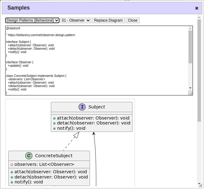
One of the biggest changes visually in Version 21 is that the Samples dropdown is no longer located at the top of the main screen. The Samples dropdowns (plural) can now be found in a new window, which is opened with the topmost button that looks like an eye. Instead of one giant monster samples dropdown, we’ve now split it into two: pick a sample category, then the sample. This greatly improves performance, and also makes it easier to zero in on what you’re looking for. Now we can add a lot more samples and not have it become way too big of a list for one single dropdown.

The other thing that’s great about the new Samples window is that it solves another problem. Previously, the only place you could view a sample was in the main editor. It wasn’t possible to work on your own diagram, and at the same time sneak a peek at a sample. Now you can! If you want to use part of the sample diagram, just copy and paste those lines into the editor. Or you can entirely replace what’s in the main editor with the contents of a sample by clicking “Replace Diagram”. Be careful though because it will overwrite (delete) anything you currently have in the editor.
Auto Refresh and Auto Scale
My favorite new features in this release are the two new checkboxes at the bottom of the editor: Refresh and Scale. Both checkboxes default to on. Refresh turns on automatic editor save/refresh, saving the diagram text when it changes and then calling the PlantUML server to refresh the image. Scale turns on automatic image scaling, making sure that the resulting diagram image is scaled down to fit on the screen if it is larger than the viewable area. Previously, if the diagram was too large, it would automatically appear below the editor, which was ok except then you had to scroll up and down to edit text and see the image. The Refresh option removes the need to scroll. Pretty handy, eh?

Updates to the Settings Window
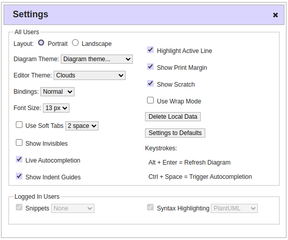
Lastly, a few things have changed in the Settings window in PlantText version 21. We moved the Diagram Theme drop-down list into this dialog and added the Delete Local Data button as well. We want to make everything very accessible but also in the right, or at least, intuitive place. You can always leave the Settings dialog open since it is not modal and mess around with the Diagram Theme easily. And the Delete Local Data button makes it easy to clear everything PlantText related from say a public computer for instance. Take a look at the image below.

What’s Next?
As far as what’s next for PlantText, I’ll discuss that in an upcoming post. Recently we conducted a quick poll to gauge interest on several possible new features, and the feedback we got was interesting. So keep an eye out for that.
Oh, we also added links to our social media in the footer. Now you can join the discussion on LinkedIn, subscribe to our channel on YouTube, and follow us on X!
